Editorial Design
February, 2020
NABA Nuova Accademia di Belle Arti
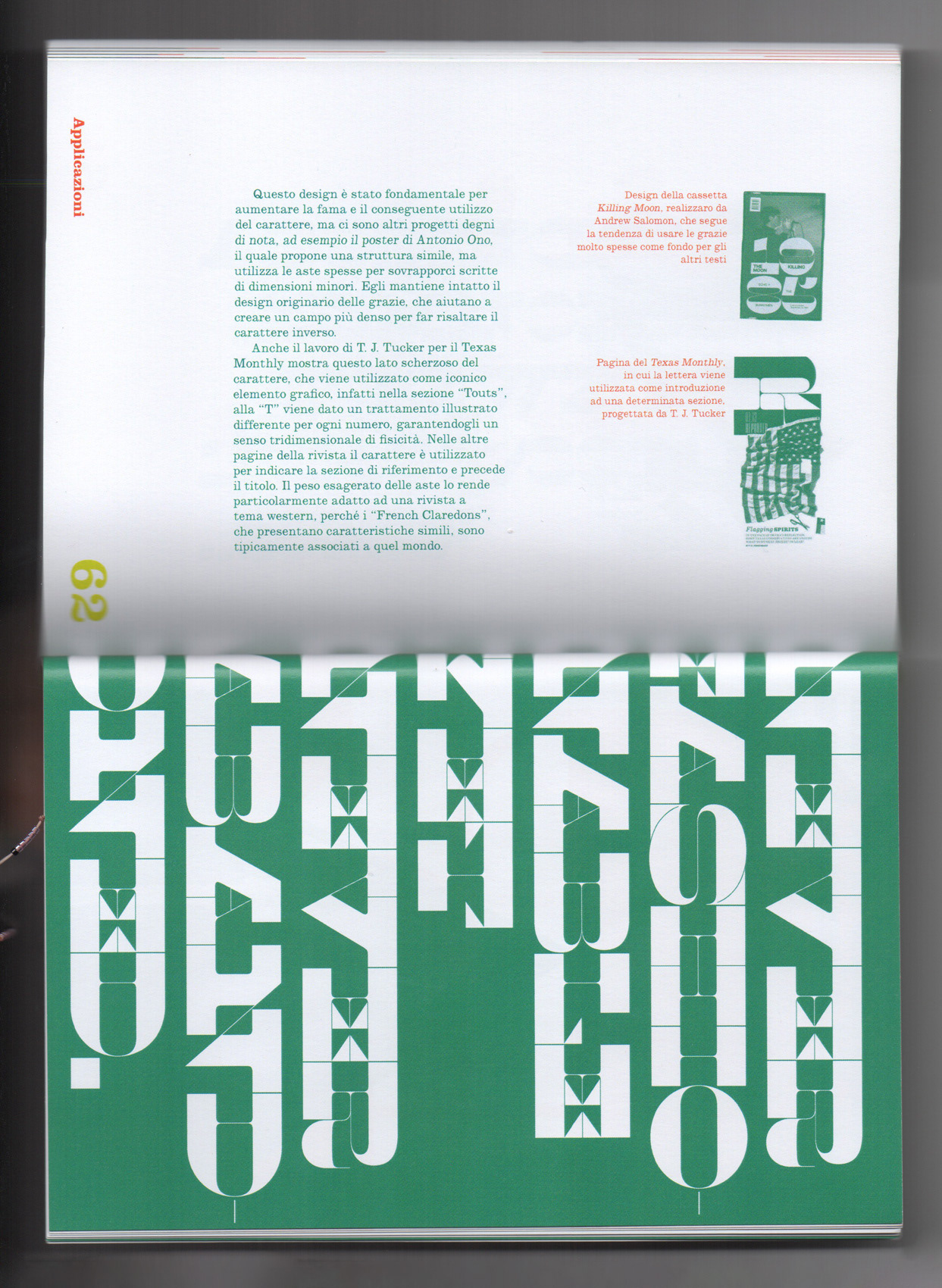
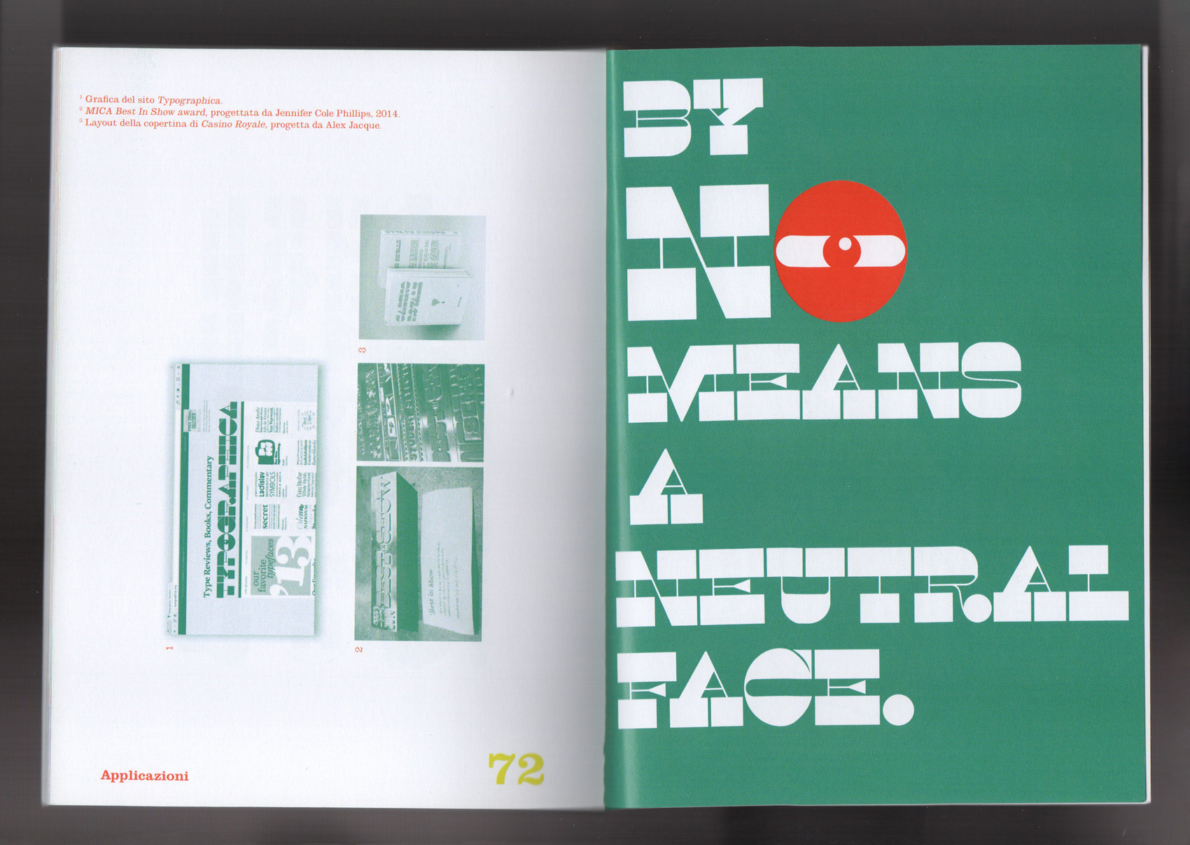
A catalogue of six different typefaces that have a feature in common, horizontal lines thicker than vertical ones.
This style is known as reverse-contrast (or reverse-stress) and was invented in the early nineteenth century as attention-grabbing novelty display designs.
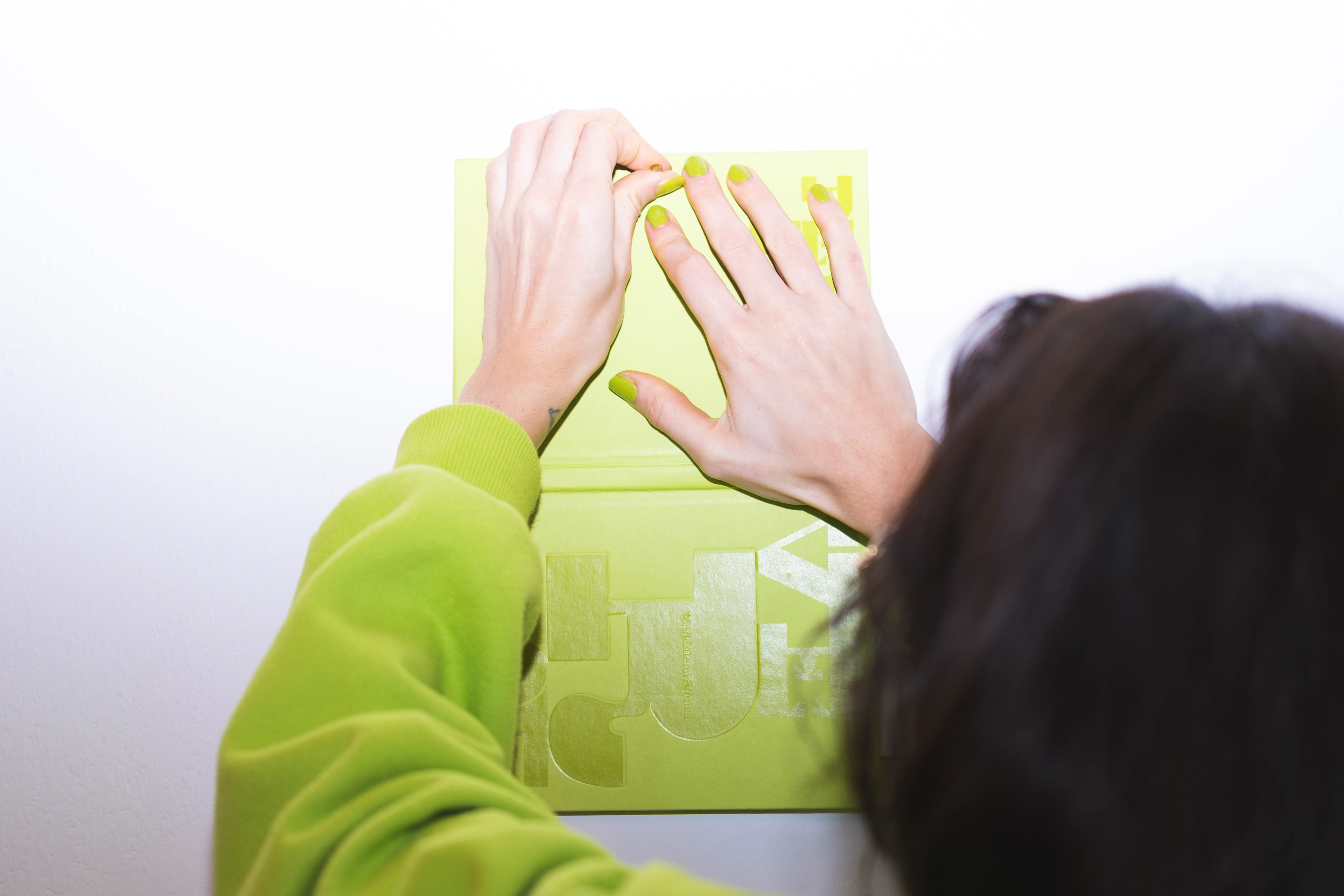
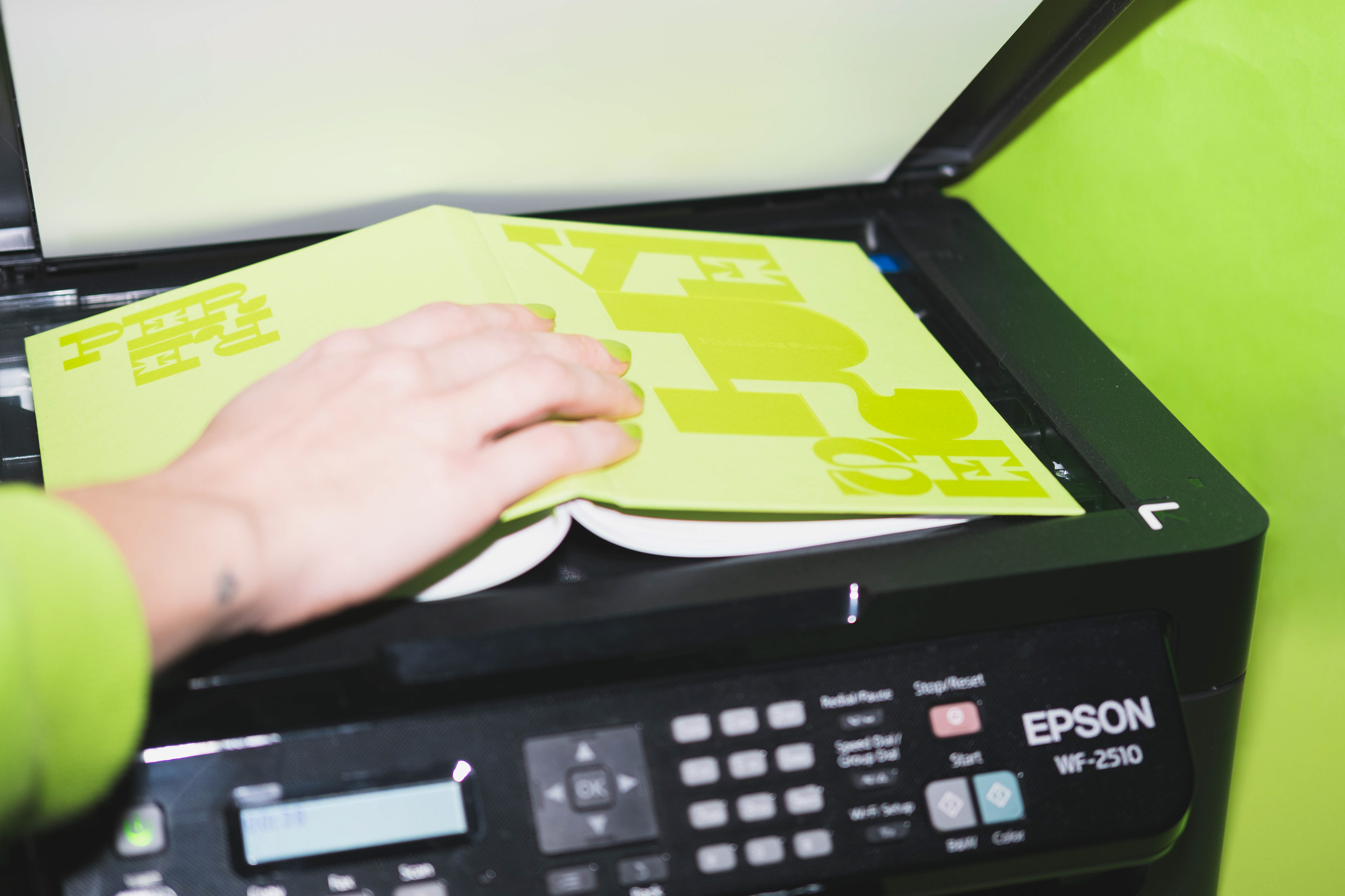
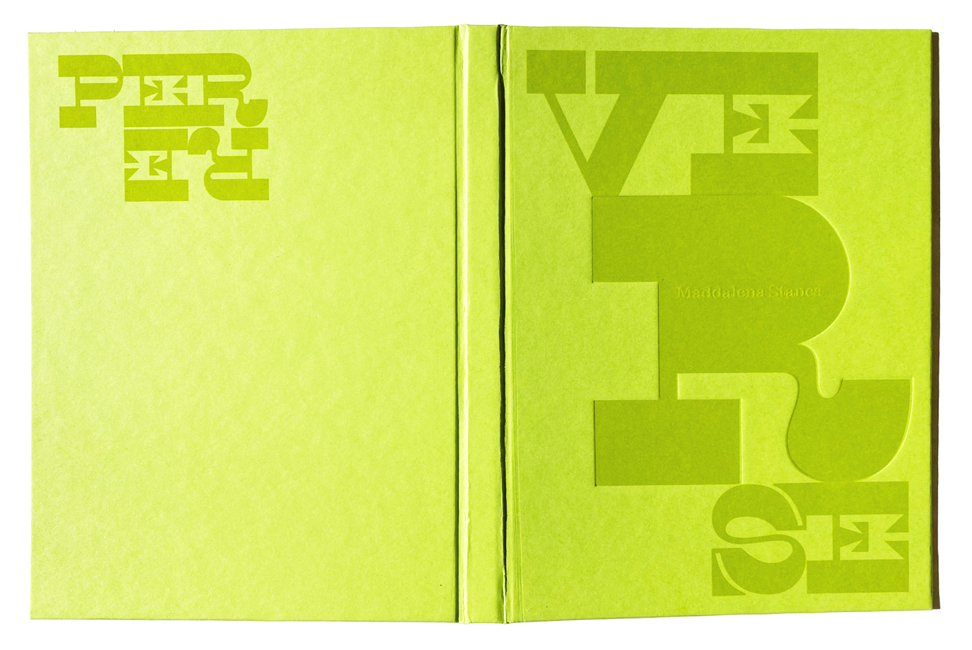
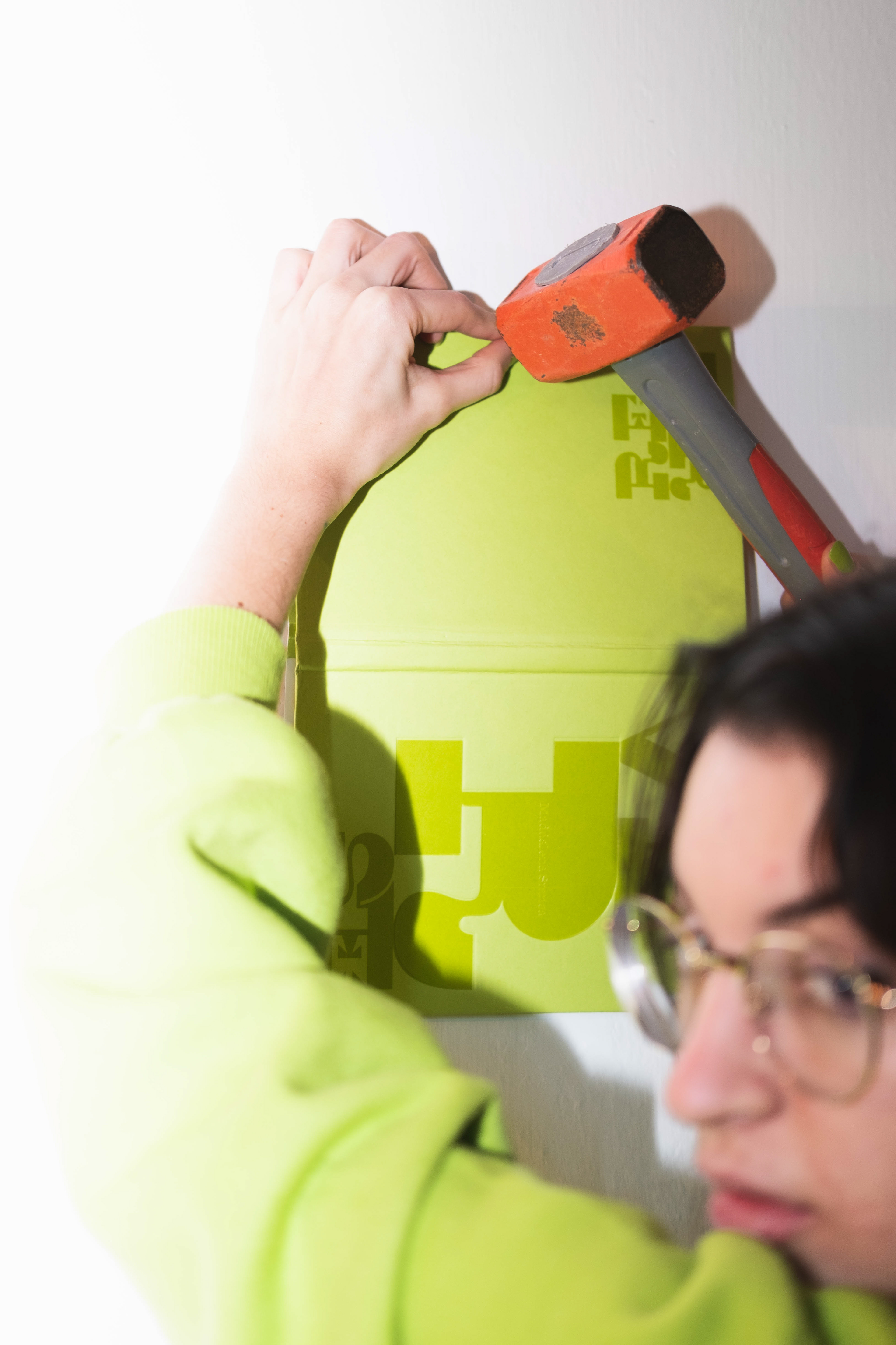
By opening completely the hard cover, you can read the whole title and create a poster: the poster layout refers to the origin of the Italian typeface, born in advertising and used for its eye-catching feature.
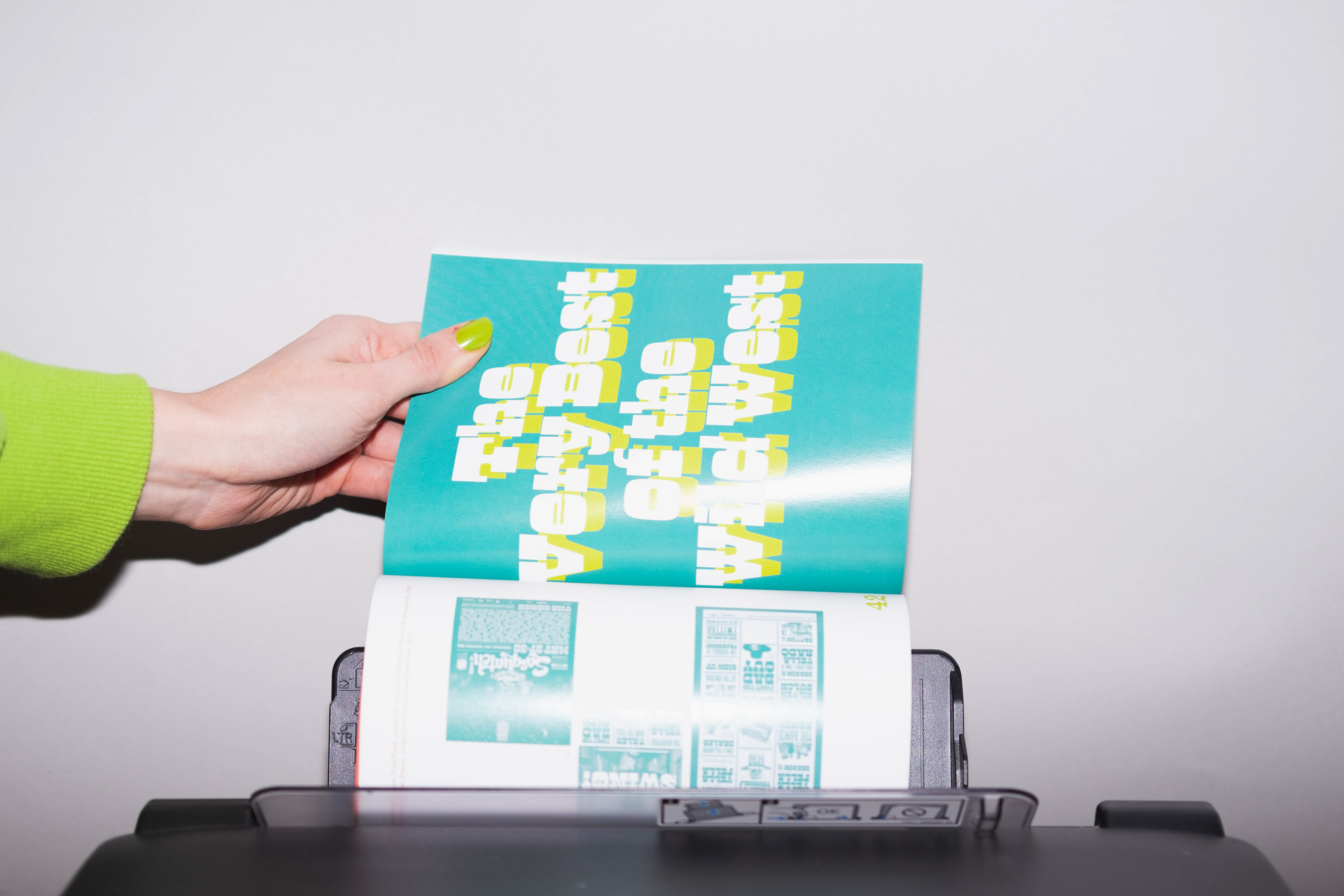
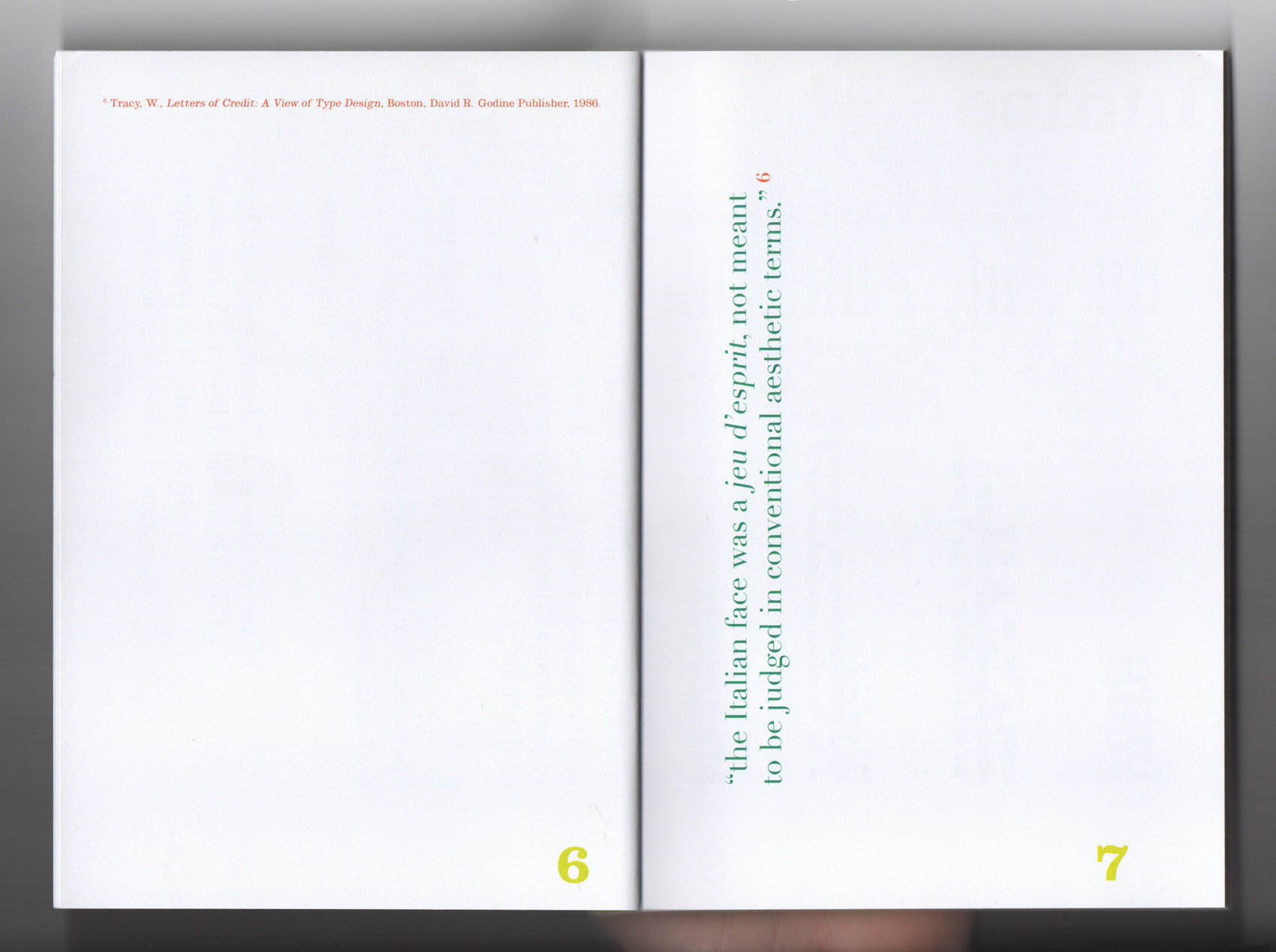
The layout recalls the traits of the letterforms: the vertical page with rotated texts confuses readers; the combination of complementary colors, massive titles and page numbers could be considered as odd, unusual, even annoying, as these typefaces were in the past.
Size: 14x19cm
Paper used: Fedrigoni Sirio Color Lime, Sappi Magno Volume
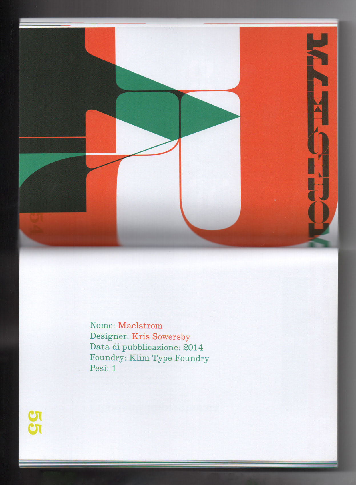
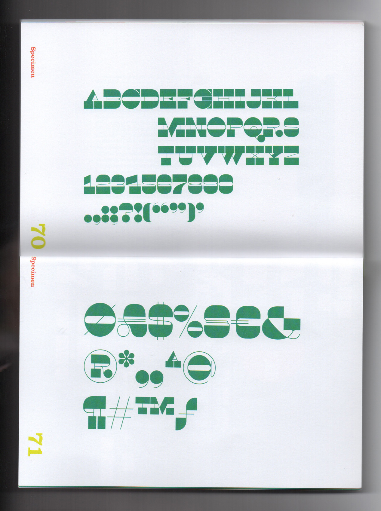
Font used: New Clarendon MT Std, Didot
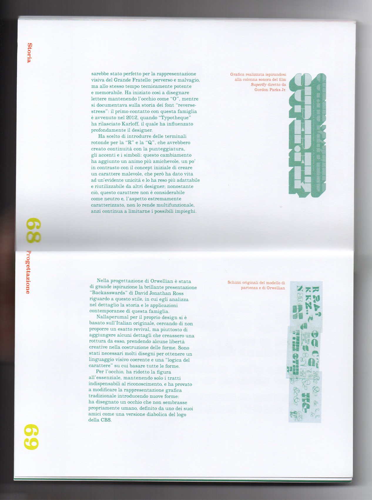
Font analyzed: Italian, Westside, Manicotti, Karloff, Maelstrom, Orwellian
Binding: Swiss binding with embossed cover
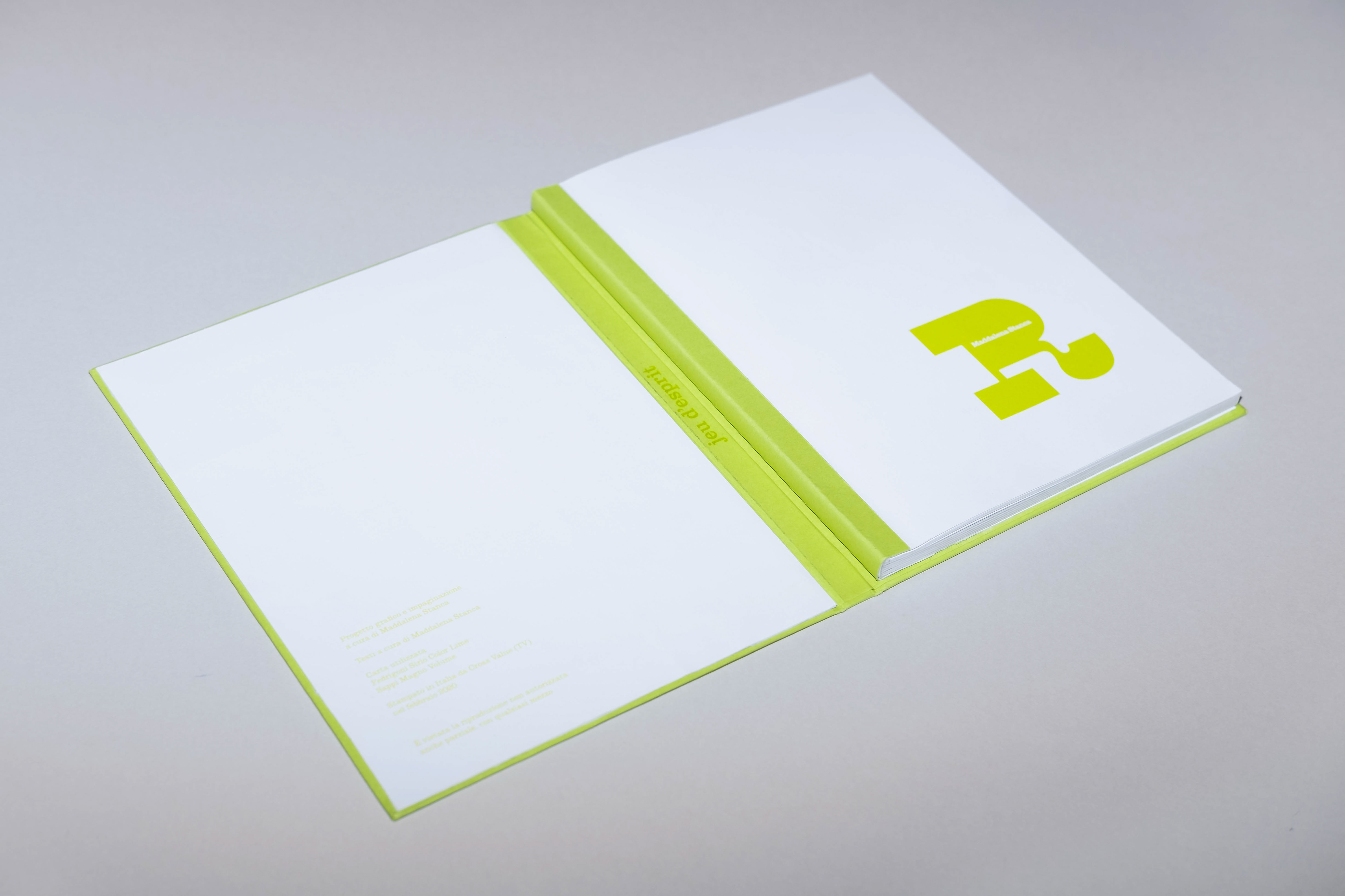
W. Tracy in 1986 called these typefaces "jeu d'esprit" (a light-hearted display of wit and cleverness); I printed her quote on the inside of the spine as a reminder of her celebration of their uniqueness.
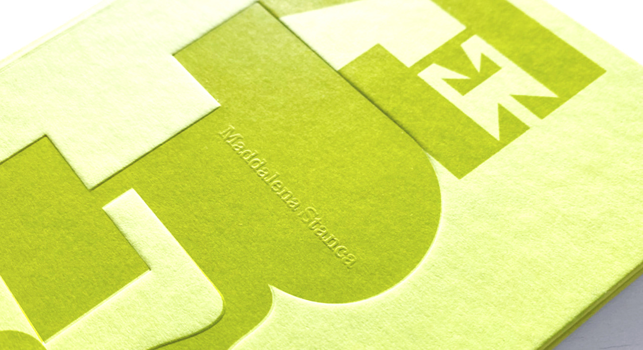
The embossing creates a delicate result, that makes my name stand out from the surface.
Be fierce, be unique!